Hello,
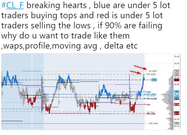
I was doing some research this weekend and came across a graph a thought would be helpful to re-create in IRT. It highlights when there is a concentration of small lot traders. Often these traders are buying highs and selling lows trying to catch a breakout...and many times become trapped. I'd like to re-create a graph like this or even add to that graph which would show data around where trapped traders are, and possibly plot the resting orders around them.


Here is a 2nd image that shows the resting orders "around" the price. This is similar to the Trail of Intentions, but is only highlighting restings that are large and may reverse price around trapping points. I'd like to build something like this in IRT.
I can't insert a 2nd pic, so here is the tweet.
https://twitter.com/blb_capital/status/997485343107698691
So any insight into specifically how you identify a "concentration of small lot traders ". At each price I can identify the number of trades below a certain size level and accumulate those, and compare with large trades. But how specifically do you measure this "concentration"? And do you sum up the activity at bottom and top 3 prices? or just bottom and top price? Let me know if you have any of those details.
Well, I know that it's a 500tick chart. I believe that it's looking at a re-constituted feed, like your consolidated tape product which puts the "puzzle" back together for large traders. Then it will find true small lots, rather than a large order broken up into pieces. It's coloring the bars based on a static value I believe, shading it with the distance away from the static value. If the value was 5, then the darkest blue would be a 1 lot, and the lightest a 10 lot lets say.
I would think that it's shading the bar at each price level based up the amount of small volume traded.
Hi, just wondering if you had any further thoughts on this?
I'm still unclear what we are looking for specifically. If we can clearly identify that, then I'm confident I can reproduce in a chart. Are we looking for small trades maybe at the top price? top 3 prices? top 5 prices? And then looking at the ratio of small trades to total trades? of small volume to total volume of those prices?
Is there a way to filter out the smaller lot traders using time and sales, and gradient them into a bar?
Hello,
I was also looking to do the same. I believe Sierra Chart already has the indicator and settings can be changed for size filtering.
I believe what is happening on the chart above is volume per second rising and size falling at both tops and bottoms.
In translation retail money coming fast, which is believed to be late traders.
The chart being used is either 500 ticks or 10 seconds, but it should work on any chart.
On the chart you shared, I see blue highlighting around relative highs and red highlighting around relative lows. I've heard this identifies "concentration of small lot traders". How is that defined? I've heard that blue represents small traders buying the high and red represents small lot traders selling the low, but I need some clarification on exactly how this is being measured. Is it simply measuring the volume of small lot traders (at price, or within bar?). Is it comparing that to a constant number, or the the volume of large traders/trades? And now I'm hearing about volume per second rising or falling which doesn't seem to fit in with the original. So if someone can give me more clarification on this, I'm sure I can put something together. I just need to understand the requirements a little better.